Your Cart is Empty

Desai & Partners is a leading contemporary law firm based in Mumbai focused on intellectual property, media and entertainment law. Kiran Desai, one of the founding partners of the firm has over fourteen years of experience in media and entertainment law and is a trusted adviser to various domestic and international companies as well as some of India’s most respected and loved celebrities. With the acquisition of a quaint new office in a heritage building in Kala Ghoda, Kiran decided to revamp the office space. Desai & Partners consulted Kulture Shop for their brand identity.
Desai & Partners wanted a crisp, modern identity to represent their technology-driven practice, which also inspires trust and responsibility. While the practice is very modern, there are four generations of legal heritage behind it. We wanted that history reflected in the brand name and after multiple variations, finalized Desai & Partners. Desai has been championing young graphic artists - Desai & Partners are the moderators for Kulture Shop's Know Your Rights events. After much discussion, 'Empowering Creativity' was decided as a tagline, covering the breadth of what IP law is in a technology-driven world. Kunal Anand, art director and designer experimented with a few logo styles but felt they were more style over substance. The logo was developed after a singular line was extended inward, cleverly capturing the 'D' and 'P' in 'Desai & Partners' with use of negative space in the type. The parallel lines display a synergy, denoting the two partners unifying to achieve the common goal, much like the yin-yang symbol. Additionally, we chose a strong Sans type family to reflect the clean, solid look.
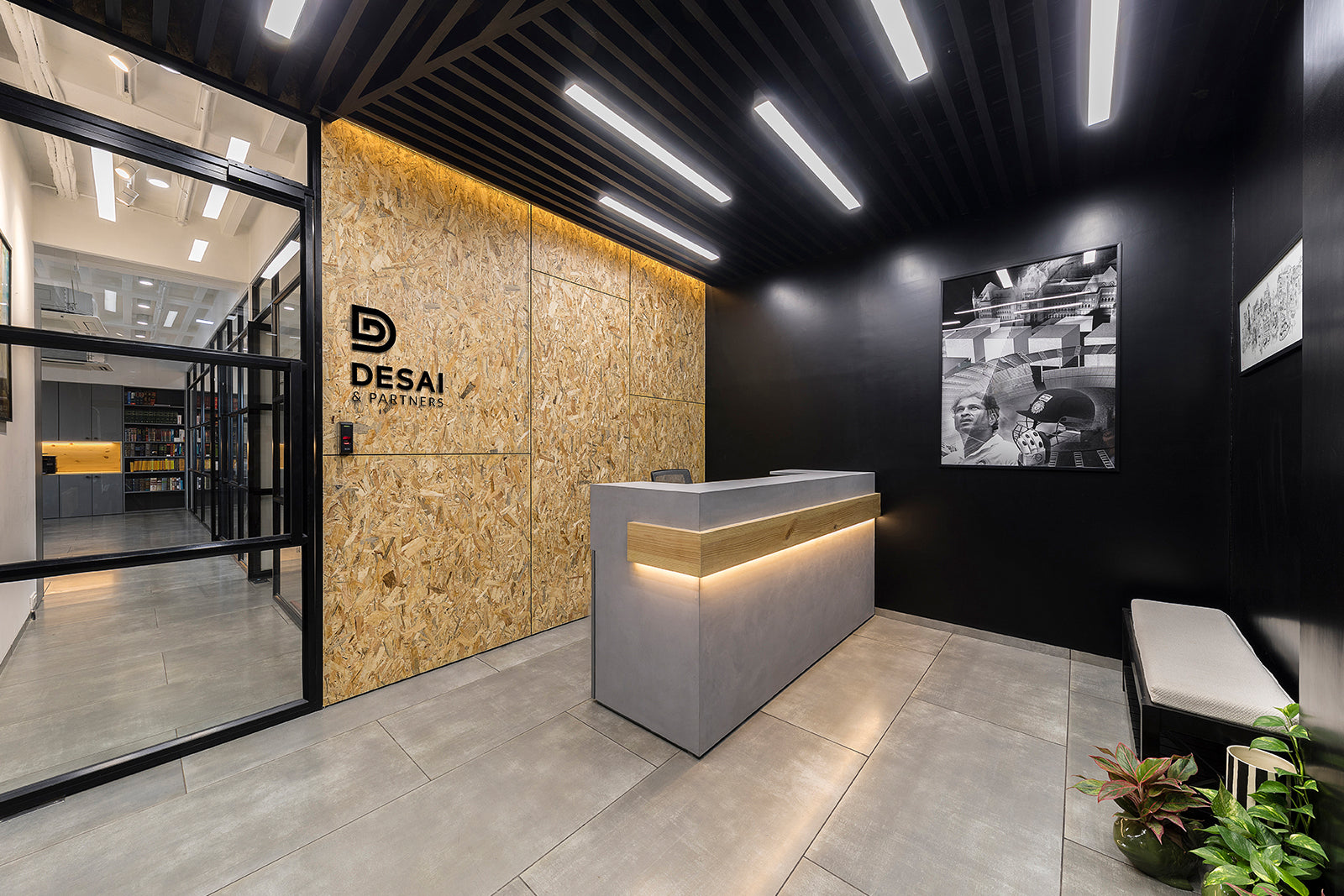
The law firm is located in a gorgeous heritage building crescent-shaped shaped art district of Mumbai - Kala Ghoda. Taking inspiration from the contemporary interiors, the brand book now captures what future interiors of other offices should look like.

The interiors mirror the brand personality - balancing a modern approach with years of heritage.

Desai has always been an advocate for the arts and we wanted that to be reflected through the space. The artworks chosen for the conference room have a strong conceptual foothold, instantly adding more character to space while enlivening it.

(L-R) Tiffin Towers and Frequency by Kunal Anand
For the smaller conference room, a typographic artwork by Kavya Singh was chosen. The artwork spells 'Explore' and compels the viewer to dive deep and investigate, making it a perfect fit for the mini-conference room. The bold colours boost the otherwise bare walls.

Kulture Shop extended this visual identity across custom created merchandise - stationery, notebooks, mugs, and coasters.
 Details of the merchandise created for Desai & Partners.
The logo symbol was adapted in distinct ways across products to retain an elegant and fresh look. A5 sized notebooks with 300 GSM lined paper was created with an exquisite black cover and single white silkscreen, bound together with a graceful red stitch spine. The mug uses the logo pattern formation in white printed onto glossy black. The brand pattern was used to create a more dynamic effect than simply using the logo mark. The logo was also split up across a set of four acrylic coasters. Digitally printed with eco-friendly inks, the coasters work individually as abstract geometric shapes and make the coherent logo when put together.

Full range of merchandisecreated for the brand.

Agency - Kulture Shop
Art Direction - Kunal Anand
Interior Design - Nitido Design
Photography - Hrishikesh Shinde
Client - Desai & Partners